
Redesign of Sisters & Co Website
Sisters & Co. started by three best friends, Hilary, Michelle, and Vivian, who love food and hospitality. They opened their restaurant in Trinity Bellwood's in August 2019, focusing on friendship, diversity, and delicious food.
The menu features fresh, home-cooked-style dishes with an Asian twist, including family recipes and traditional breakfast items. They also offer a variety of drinks, including a special coffee blend with a unique taste.
Purpose
The purpose of this project was to design and implement an intuitive online ordering system to enhance customer convenience and expand the restaurant's reach. By providing a platform where customers can browse the menu and place orders anytime, anywhere, the project aimed to cater to busy families, professionals, and individuals seeking quick, hassle-free meal options. Additionally, integrating the system with social media was intended to attract tech-savvy customers and boost the restaurant’s digital presence. The goal was to increase sales, particularly during peak hours, while giving the restaurant a competitive edge in the rapidly growing online food ordering market.
Approach
To achieve the project’s purpose of creating a user-friendly online ordering system, we began by identifying key user needs and challenges through comprehensive research. This included conducting surveys, interviews, and focus groups with target audiences, such as local residents, busy professionals, and families. By analyzing this feedback, we gained valuable insights into user preferences and pain points, such as the need for efficient navigation, detailed product descriptions, and flexible delivery options. These findings laid the foundation for our design decisions, ensuring that every feature was tailored to enhance user experience and meet customer expectations.
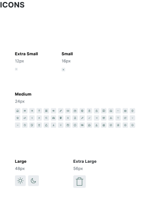
UI Style Guide
The UI style guide we created serves as a foundational reference for maintaining design consistency across the app. It includes a well-defined color palette, with dark green and mustard yellow as the primary colors to represent a sophisticated, mid- to high-end brand identity. Secondary colors of grey, black, and white enhance readability and ensure visual balance. The typography choices, centered around the modern sans-serif font Futura, provide versatility and clarity. This guide also includes specifications for button styles, spacing, and other UI elements, ensuring a cohesive and intuitive user interface.


My Role
UX/UI Designer, Research, Ideation, Wireframes, Low Fidelity design, High Fidelity Design, Prototyping, Usability Testing.


User Flow
What I did
1. UI style Guide
2. User Flow
3. Wire flow, Sketching and prototyping
4. Low fidelity, Mid Fidelity and High fidelity design and prototyping
5.User testing

We create hand-drawn sketches, develop a wire flow, and establish a UI Style Guide to guide the design. The goal is to visualize the user experience and establish a foundation for further development.


After receiving feedback on our low-fidelity prototype, we faced the challenge of integrating conflicting opinions while staying true to our design vision. Key feedback included enhancing the navigation bar's simplicity, ensuring clear functionality for the hamburger menu, improving cart usability (item count display, empty cart feedback, deletion options), and optimizing mobile usability with sliders for long menus and direct item addition to the cart.
To address these, we collaborated to evaluate and prioritize changes, ensuring all team perspectives were considered. This iterative process helped refine our approach, aligning the design more closely with user needs and expectations.
we developed a high-fidelity prototype while addressing challenges such as preview mode display issues and managing complex cart functionality. By following task flows and conducting iterative testing, we refined the design to meet project requirements and enhance the user experience.


The wireflow diagram visualizes the user journey through the app, illustrating how screens are interconnected and the flow of interactions. It maps out the steps a user takes to complete key tasks, from logging in to making a purchase, ensuring the design supports an intuitive and efficient navigation experience. By combining wireframes with flowcharts, the wireflow provides a clear overview of screen connections, interaction points, and task sequences, helping the team stay aligned on the app's overall structure and user flow.


In conclusion, the development of the high-fidelity prototype for Sister & Co Restaurant has been a valuable learning experience. Through iterative testing, feedback integration, and the creation of a UI style guide, we refined the design to align with both user needs and brand identity. Despite challenges, such as technical issues and cart functionality complexities, our collaborative approach enabled us to resolve problems effectively and deliver a user-friendly, cohesive design that meets the project requirements. This project has strengthened my skills in UI design, prototyping, and problem-solving, and I am excited to apply these learnings to future projects.